
Force Design System
Eliminating design debt with a scalable design system
Overview
When our design team started to grow and take on more projects, our ability to stay consistent with our component libraries became a challenge, and our design debt grew exponentially. I knew that a properly developed design system would help us build and collaborate more efficiently, but in order to get there I would need to build our system from the ground up.
My role
Design Systems Lead
The team
- 1 Product Designer (me)
- 1 Visual Designer
- 1 iOS Engineer
- 1 Android Engineer
- 1 Front End Developer
The timeline
About 3–4 months
Understanding design systems
If you’re a product designer, chances are you’ve already heard of a design system. The design community uses the term in various ways, but we can define it as
“...a set of interconnected patterns and shared practices coherently organized to achieve the purpose of digital products.” -Alla Kholmatova, Design Systems
As a team, we had some previous knowledge of how a design system should work, but our existing systems lacked the organization and consistency needed to scale and be efficient. What was also missing was a shared understanding of how to style and layout our designs across our various products. To kickstart this initiative, we decided to begin overhauling our most recent project, the Force design system.
THE PLAN
- Audit the design system
- List the styles and components
- Build the pattern library
- Collaborate with engineering
Step 1: Audit the design system
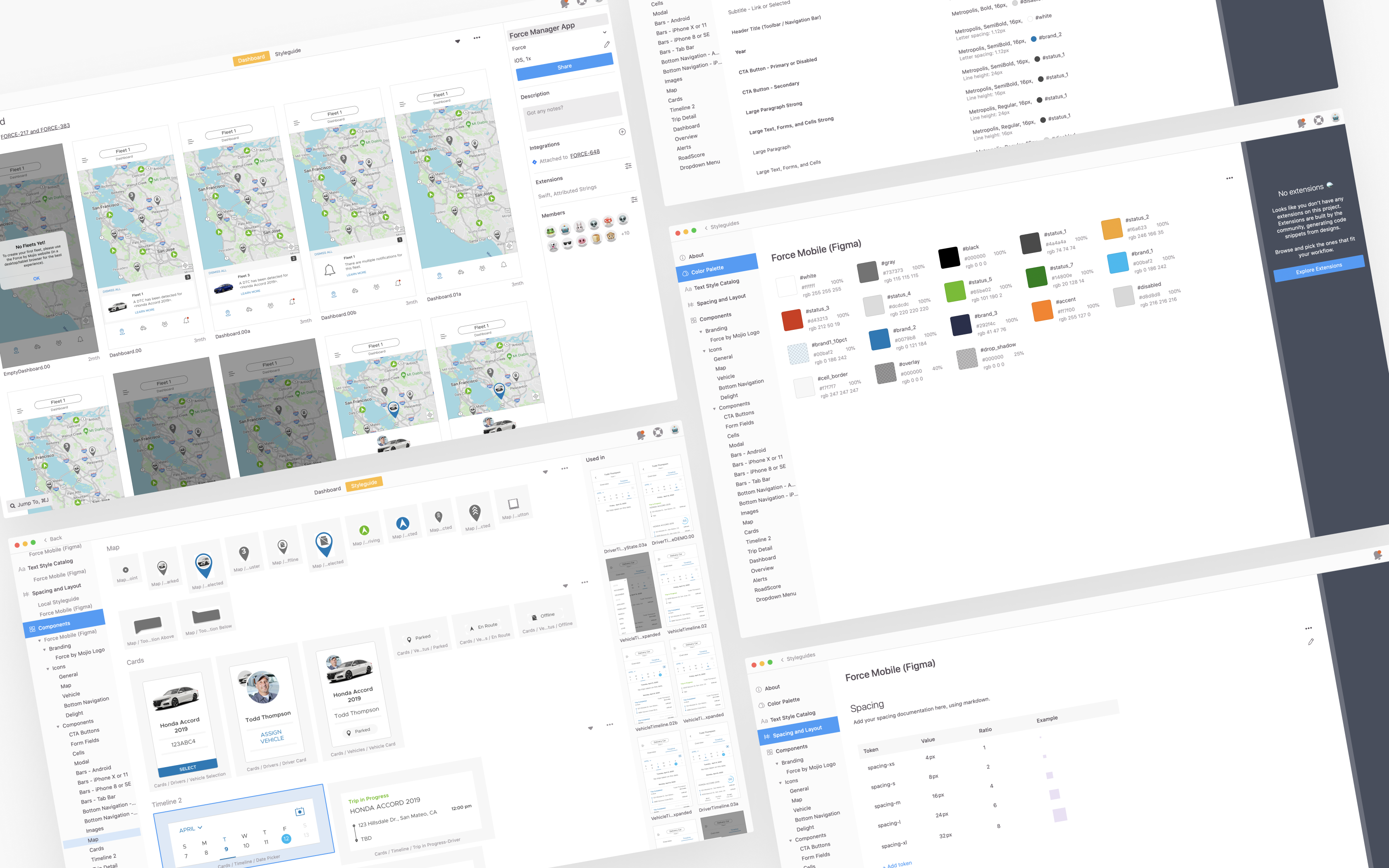
In order to fully understand what wasn’t working with our system, I started with a full audit of our existing components, color styles, and type styles. I took screenshots of these elements so I could quickly view all of them at a glance. This process made it easier to point out existing design inconsistencies, as well as remove any elements that were either unused or irrelevant.
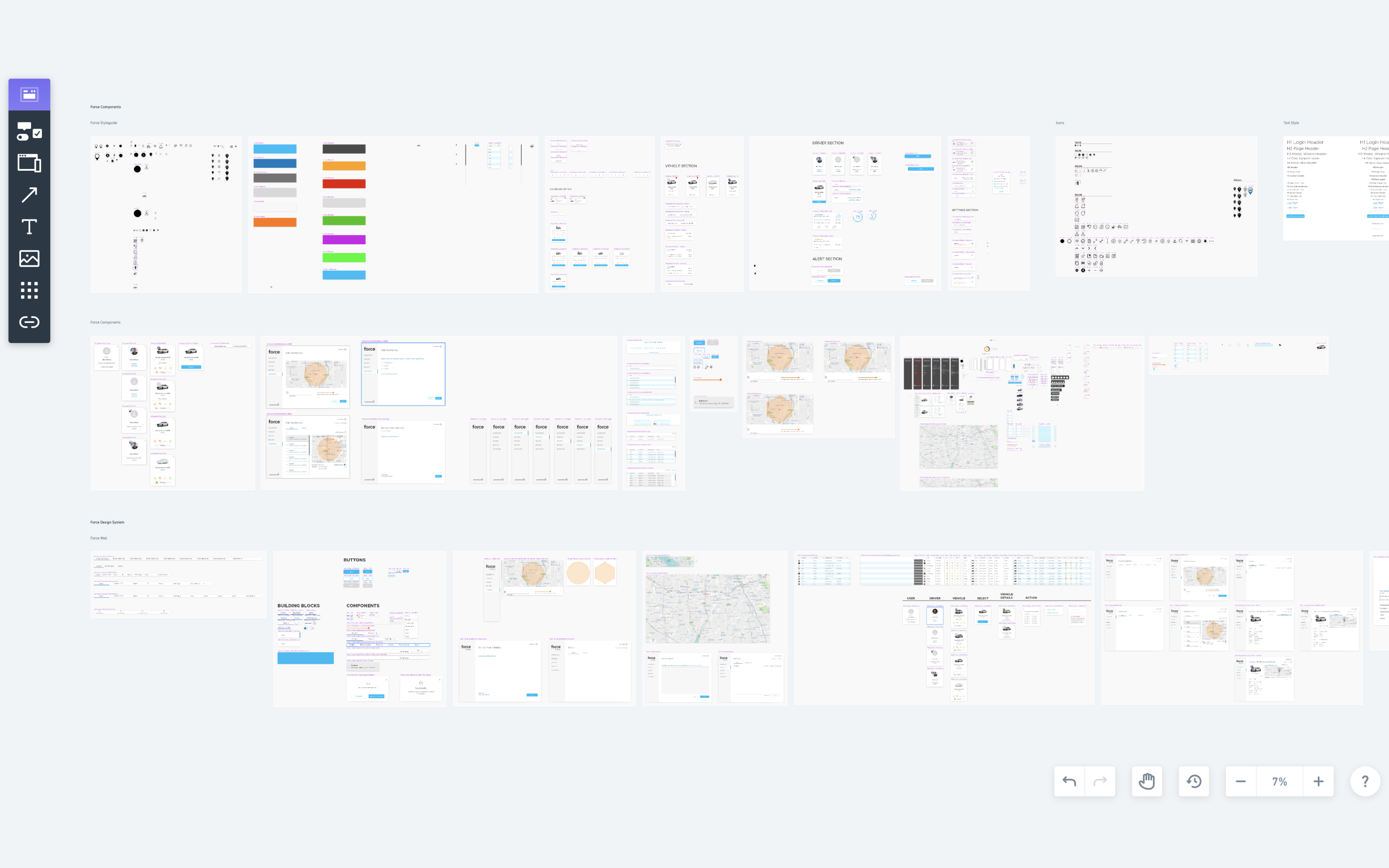
Collecting screenshots of all existing component libraries to run a design system audit
Step 2: List the styles and components
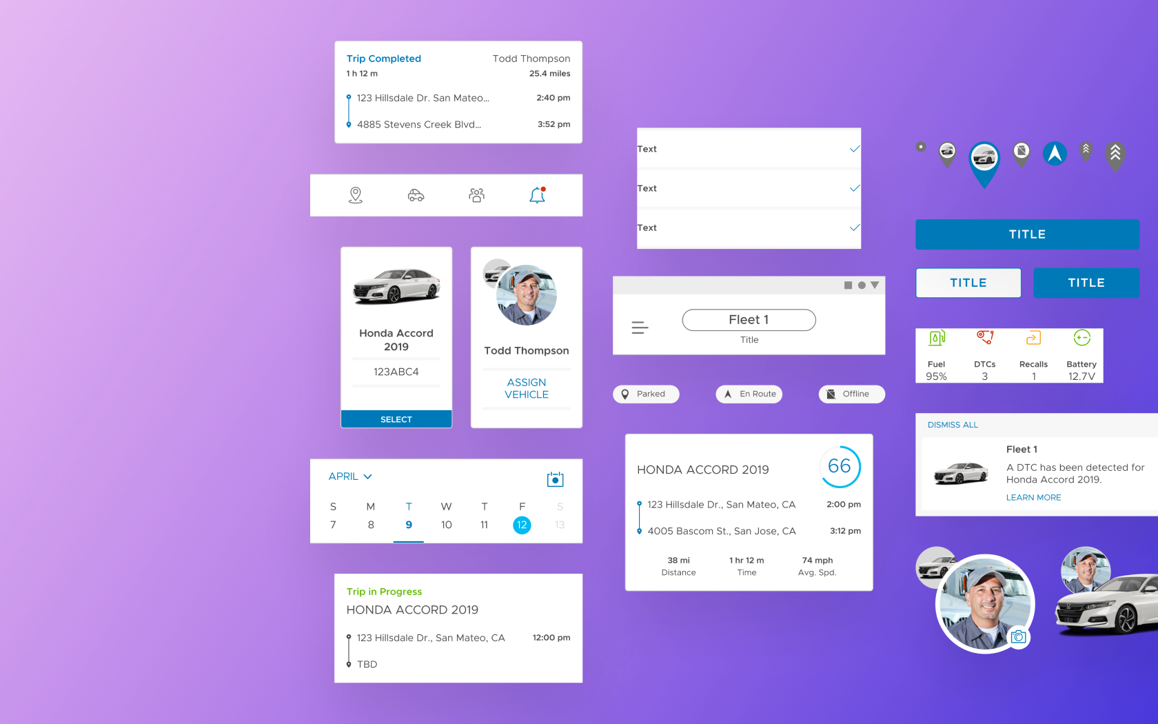
The next step was to list down the components, type, and colors used throughout both mobile apps. I took screenshots of our app feature sections and mapped them out to analyze our use of these patterns. I then went through each screen to see if there were opportunities to pare down type styles, find a more uniform use of color, and build more consistency into our components.
Our previous design system had no real constraints, so it eventually became overloaded with too many rogue unorganized elements. My goal with this design system was to create a concise group of organized styles and components that would be more comprehensible and easier for us to implement and scale in the future.
One thing I’ve definitely learned from building a design system—it’s much easier to add than to remove.
Listing existing components, type, and colors used in our Force apps
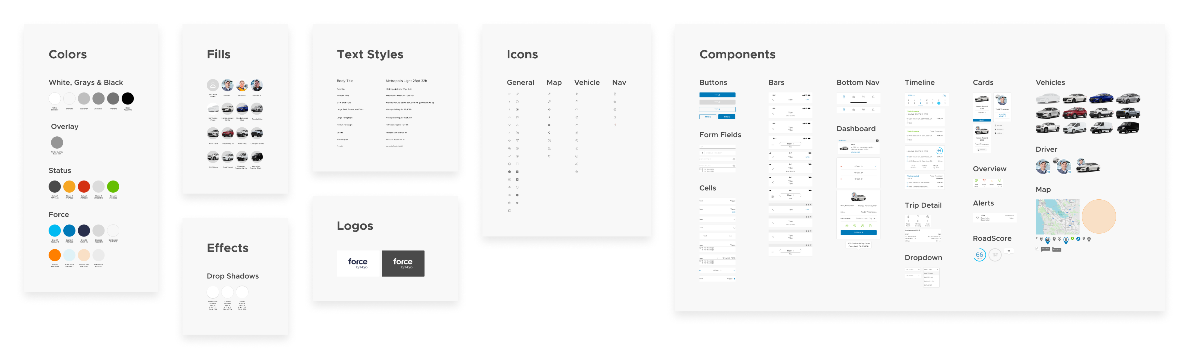
Step 3: Build the pattern library
To make sure our components could be utilized in a more consistent and efficient manner, I researched how Figma’s features could be leveraged to create better building blocks. Overall, I was able to get rid of more than half of our original color and type styles.
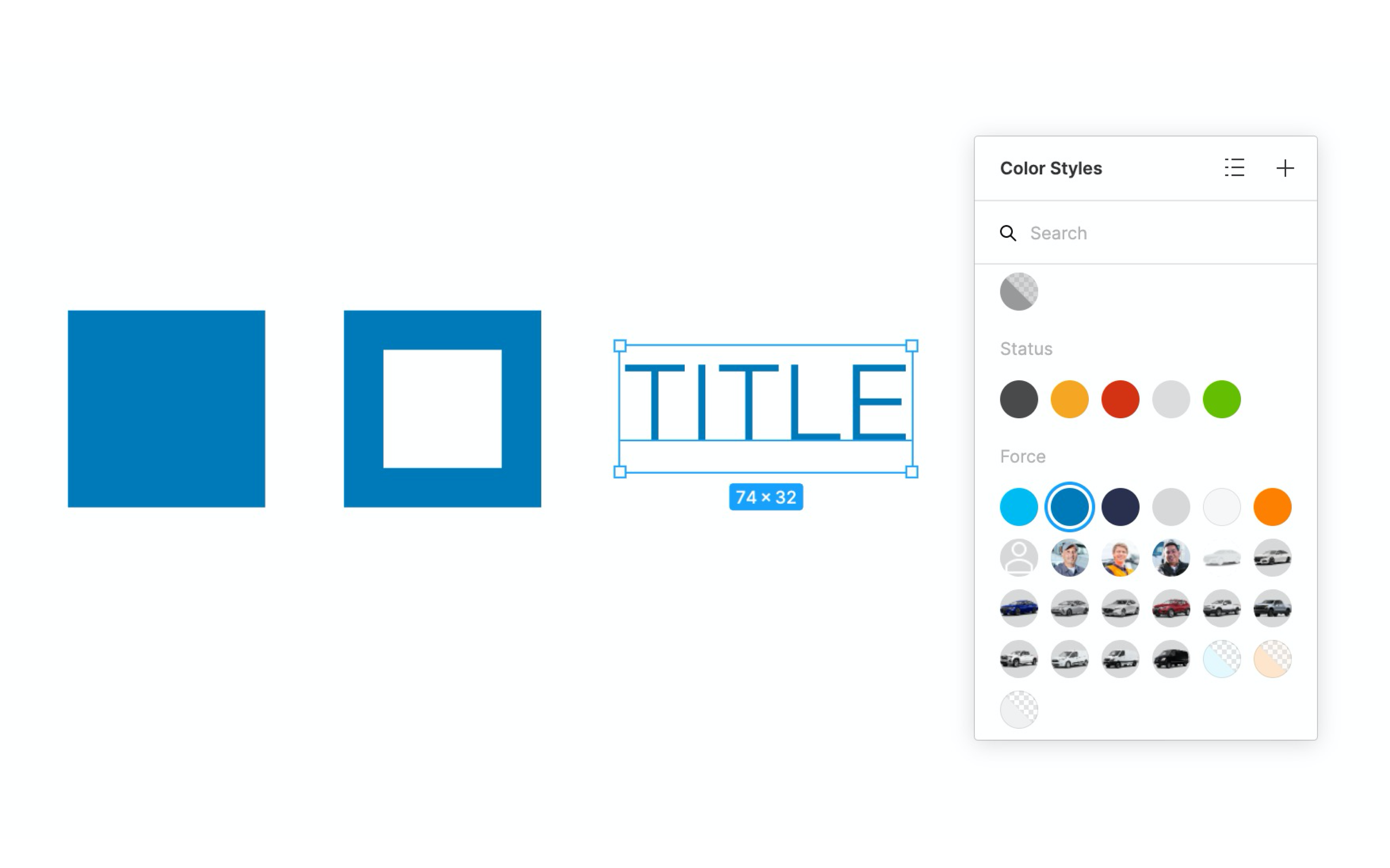
Setting up color styles for fill, stroke, and type
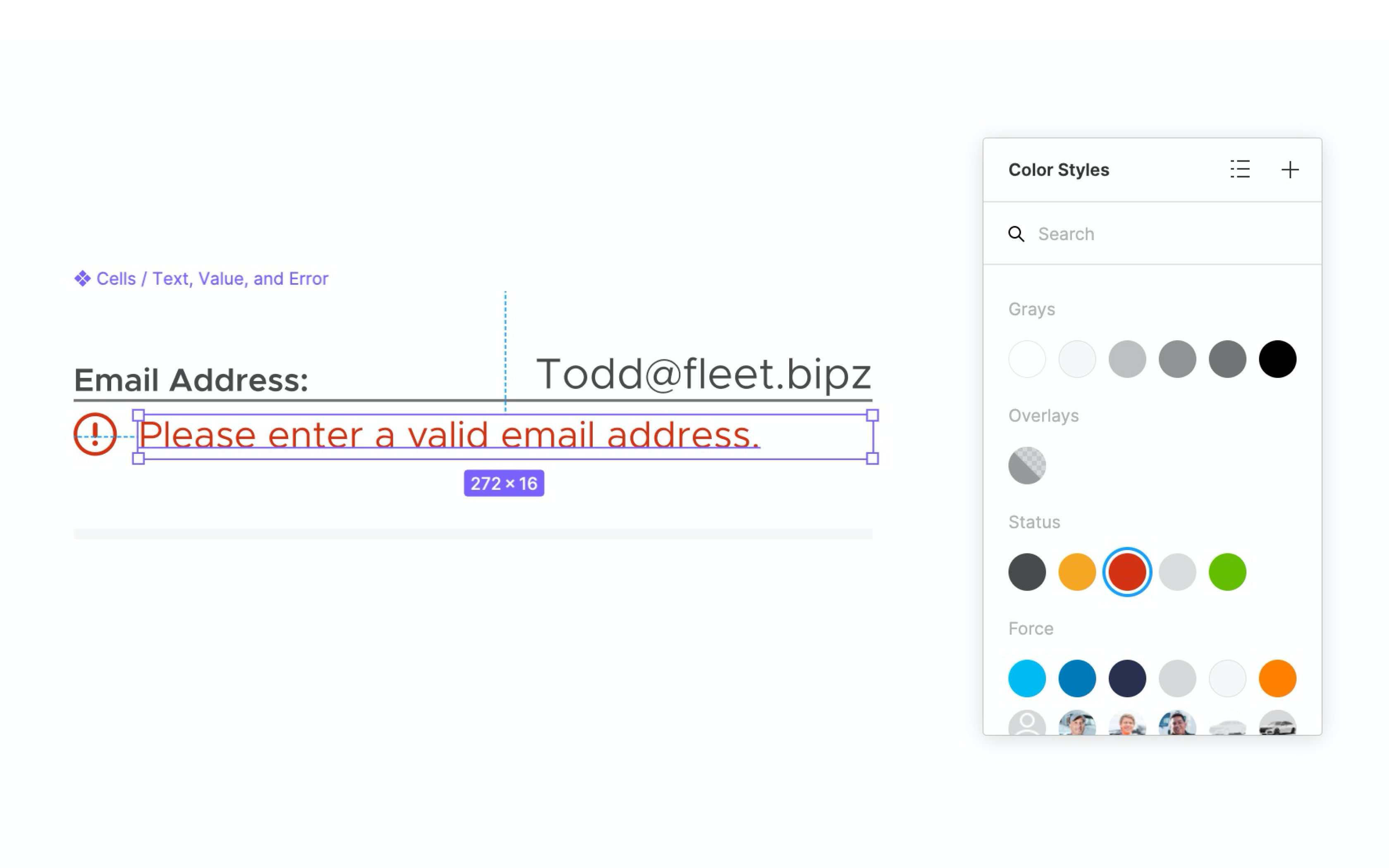
Applying global status colors across various states within our apps
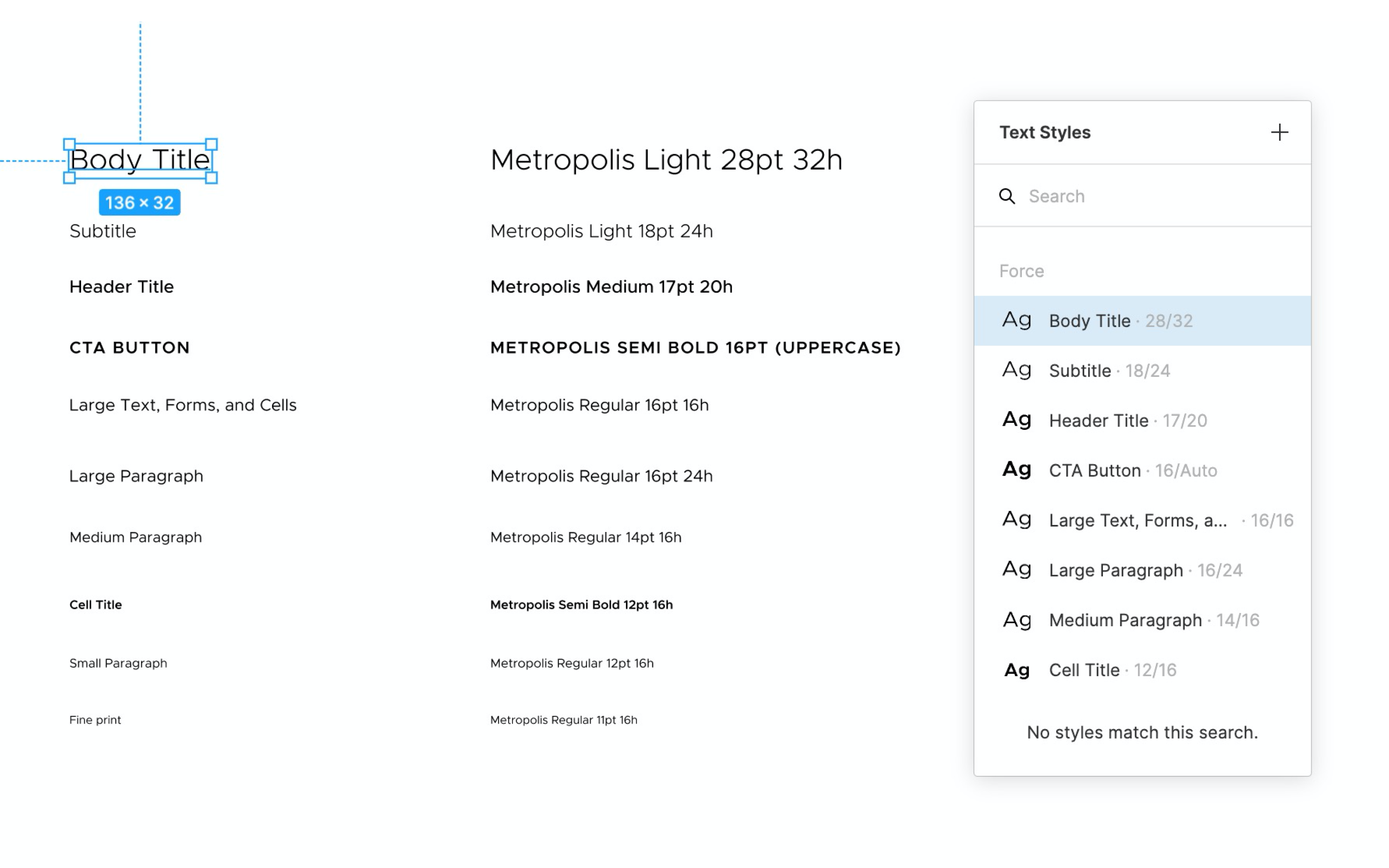
Refining and narrowing down to only the necessary type styles
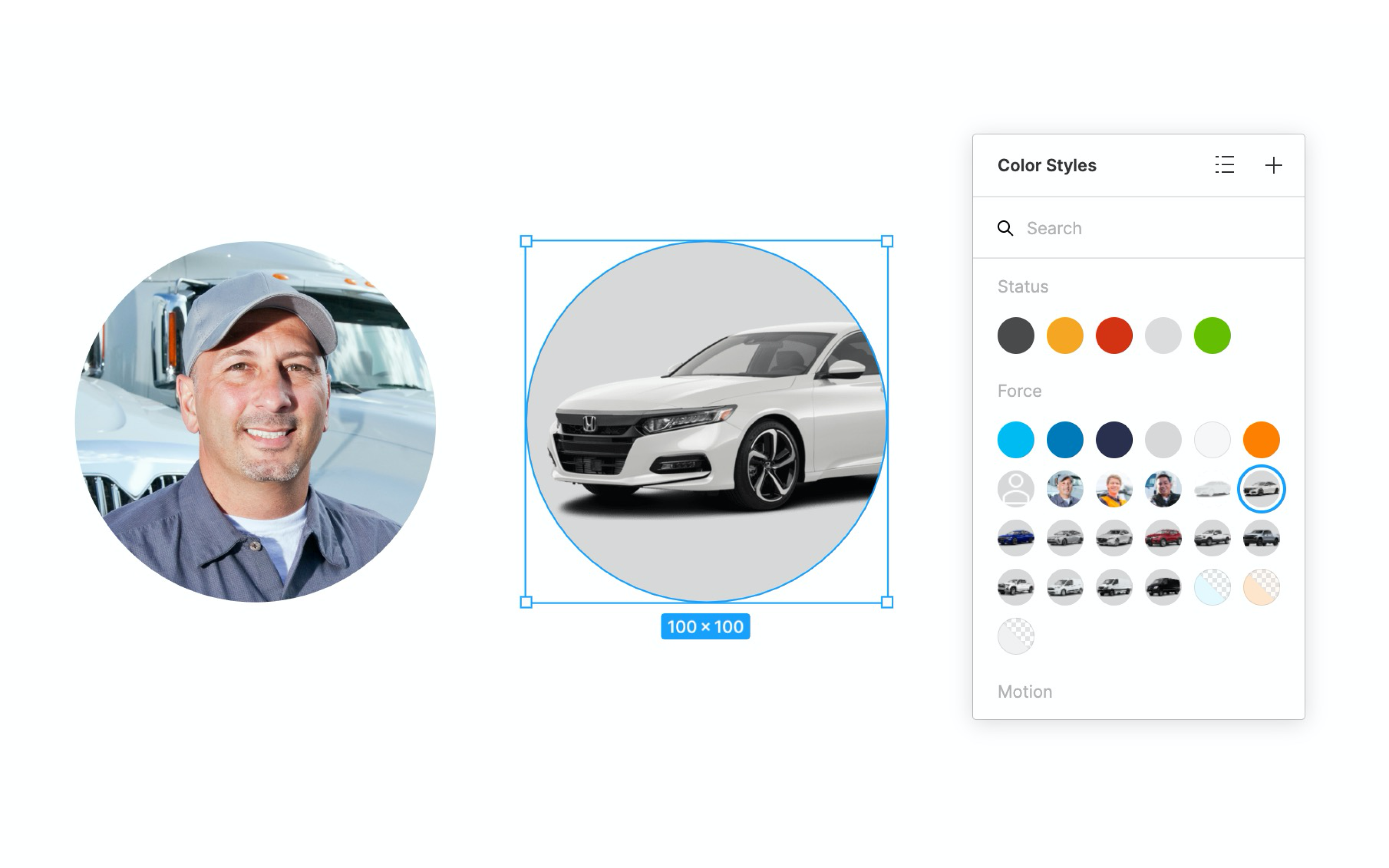
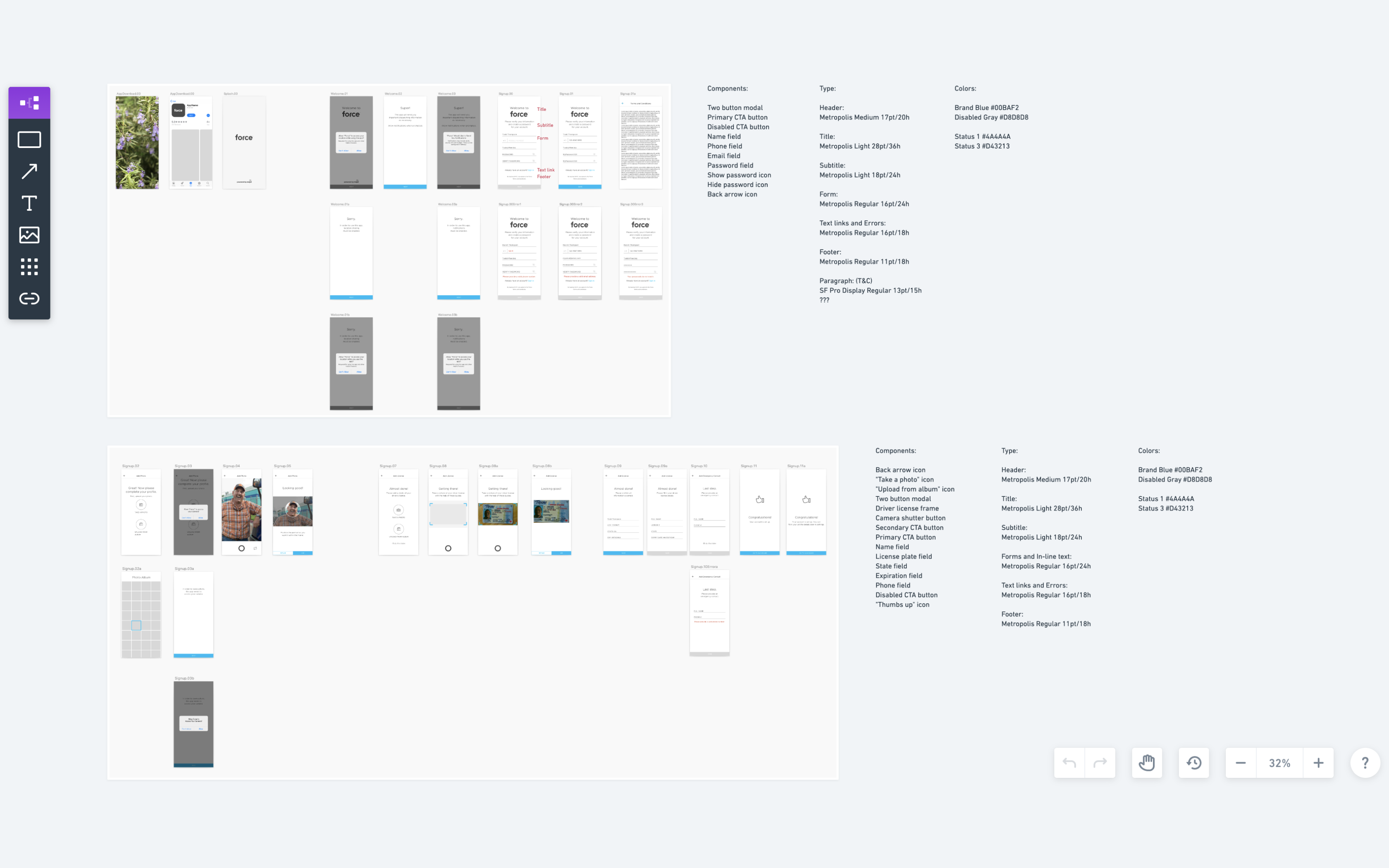
Setting up mock profiles and vehicles to use for demos and marketing

Utilizing auto layout to build efficient components
Designing the design system
While the various parts of the design system were being created, I also worked on organizing and bringing everything together in a cohesive way. Within the same file, elements were grouped into categories and then grouped again into subcategories based on their feature or purpose. Trimming down the previous design system took a great deal of initial time and effort, but I think I was able to create a solid foundation that would be much more manageable and functionally scalable in the future.
Step 4: Collaborate with engineering
The final step was to team up with our engineering team to align on hi-fidelity screens, along with the colors, type, and components I had created in Figma. We utilized Zeplin in our workflow so developers could quickly reference all relevant spacing, styles, and components at a glance through the use of Zeplin’s global styleguide feature. Developers could also view which screens were using which components, and how they were all connected and reused throughout our apps, which made design handoff seamless.
Utilizing Zeplin’s styleguide feature for efficient dev handoff
What was the outcome?
In the end, the audit helped me remove many unused, duplicate, and outdated components, and by simplifying the previous design system, I was able to eliminate almost all of our previous design debt. In addition, by implementing the new design handoff workflow, I was able to cut down on Design QA tickets.
30%
Reduction of components
90%
Decrease in design debt
75%
Decrease in Design QA tickets
Next Project

