
Force Mobile Design System
Overview
When our design team started to grow and take on more projects, our ability to stay consistent with our symbol libraries became a challenge. We knew that a properly developed design system would help us build and collaborate more efficiently, but in order to get there we would need to start by designing our system from the ground up.
My Role
Design Systems Lead
Skill set
Design Systems
Design System Overhaul
If you’re a product designer, chances are you’ve already heard of a design system. The design community uses the term in various ways, but we can define it as
“...a set of interconnected patterns and shared practices coherently organized to achieve the purpose of digital products.” -Alla Kholmatova, Design Systems
As a team, we had some previous knowledge of how a design system should work, but our existing systems lacked the organization and consistency needed to scale and be efficient. What was also missing was a shared understanding of how to style and layout our designs across our various products. To kickstart this initiative, we decided to begin overhauling our most recent project, the Force Mobile Design System.
THE PLAN
1
Audit the design system
2
List the styles and components
3
Build the pattern library
4
Incorporate the Zeplin styleguide
Step 1: Audit the design system
In order to fully understand what wasn’t working with our system, I started with a full audit of our existing components, color styles, and type styles. I took screenshots of these elements and placed them in Whimsical so I could quickly view all of them at a glance. This process made it easier to point out existing design inconsistencies, as well as remove any elements that were either unused or irrelevant.
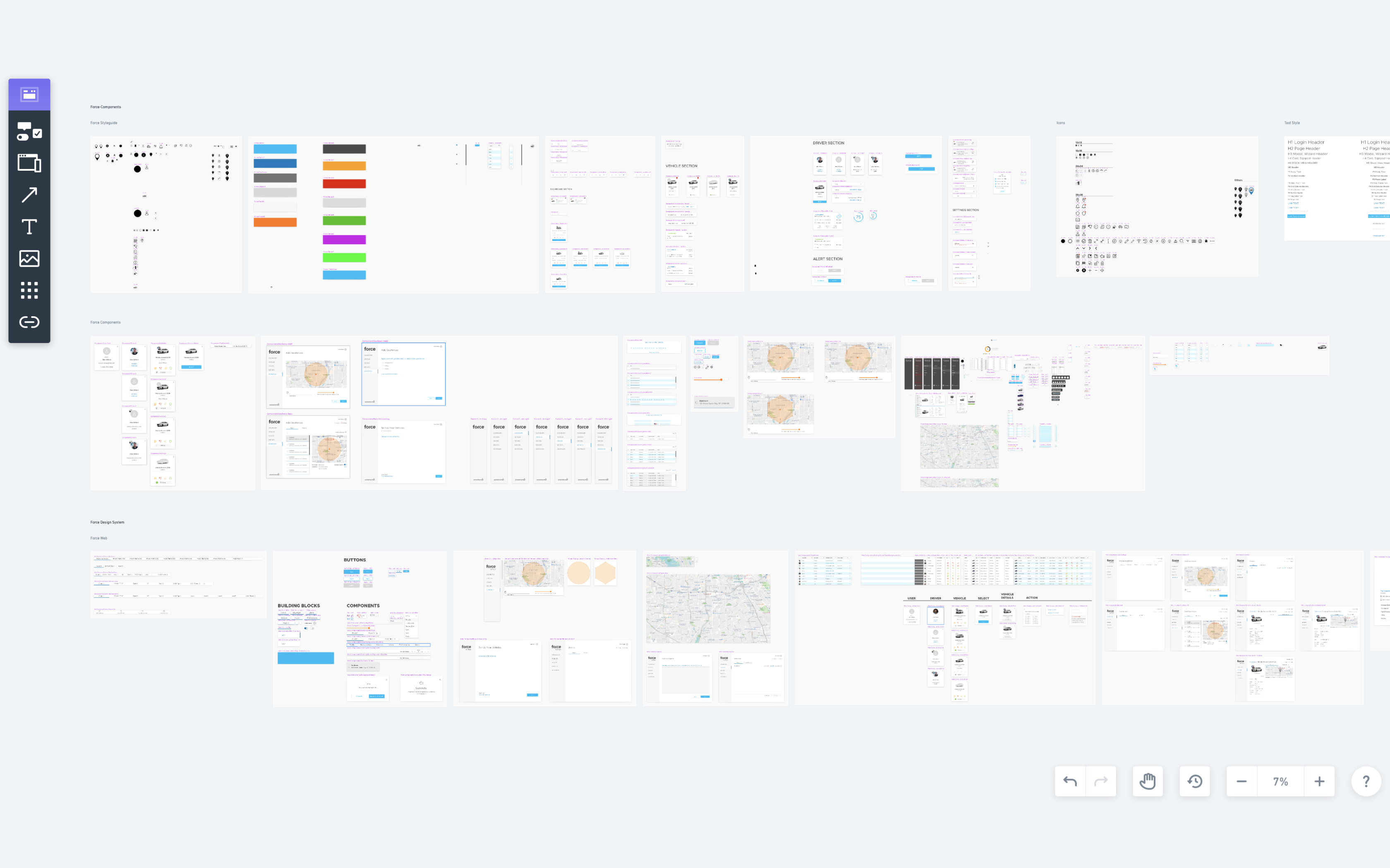
Using Whimsical to visually collect all existing Sketch symbol libraries and run a design system audit
Step 2: List the styles and components
The next step was to list down the components, type, and colors used throughout both mobile apps. I took screenshots of our app feature sections and mapped them out in Whimsical to analyze our use of these patterns. I then went through each screen to see if there were opportunities to pare down type styles, find a more uniform use of color, and build more consistency into our components.
Our previous design system had no real constraints, so it eventually became overloaded with too many rogue unorganized elements. My goal with this design system was to create a concise group of organized styles and components that would be more comprehensible and easier for us to implement and scale in the future.
One thing I’ve definitely learned from building a design system is that it’s much easier to add than it is to remove.
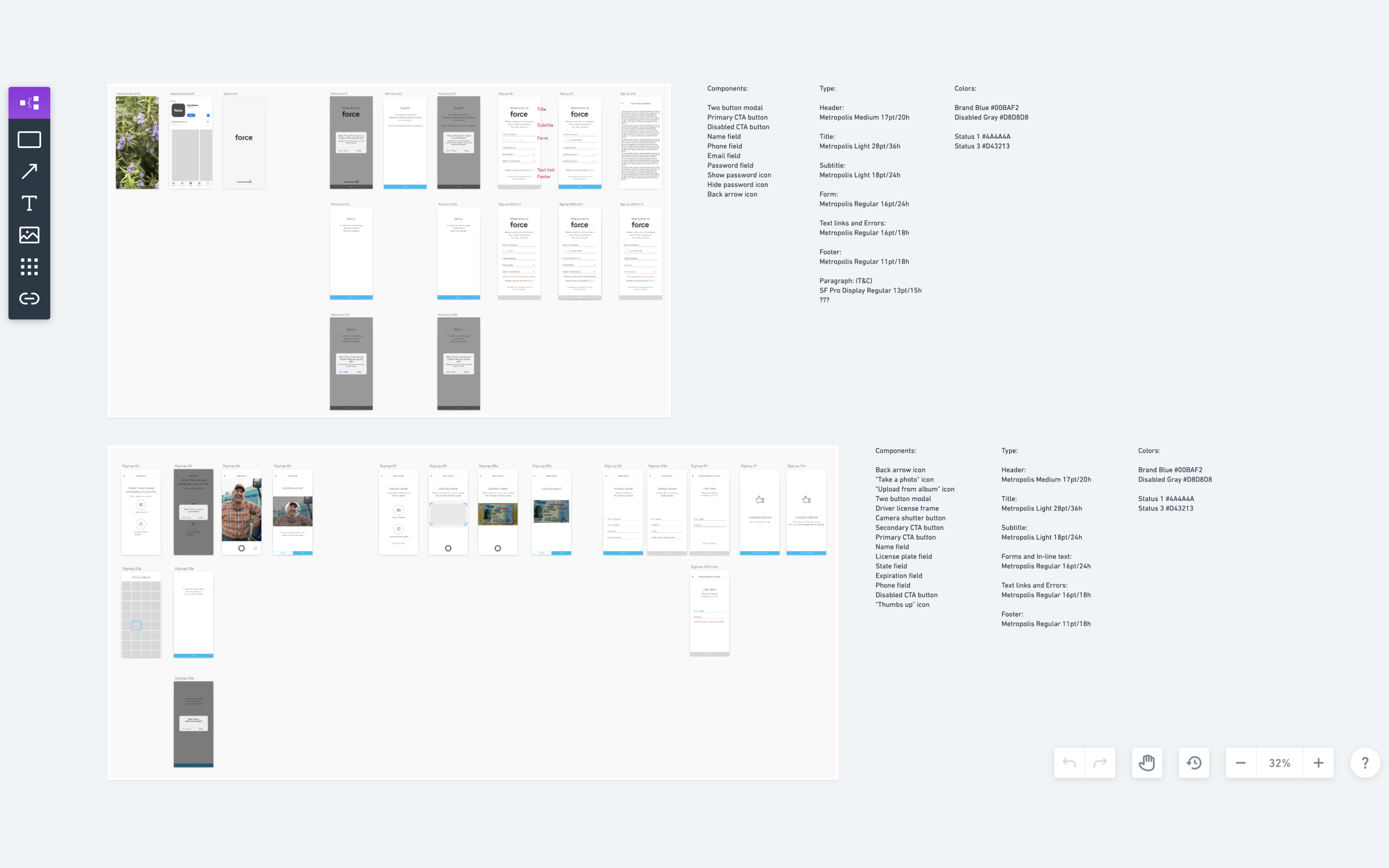
Using Whimsical to list existing components, type, and colors used in our Force mobile apps
Step 3: Build the pattern library
To make sure our components could be utilized in a more consistent and efficient manner, I reviewed the symbols we created in Sketch and researched how Figma’s unique features could be leveraged to create better building blocks.
Styles
I was surprised to see that color styles were treated more globally, and could be applied to fills, strokes, and even type. This made selecting and updating colors for multiple screens very easy. Text styles were an even bigger surprise because there was no need to create an individual style for each alignment, color, and size variation, which was always a time consuming process in Sketch. Because of this, I was able to get rid of more than half of our original type styles.
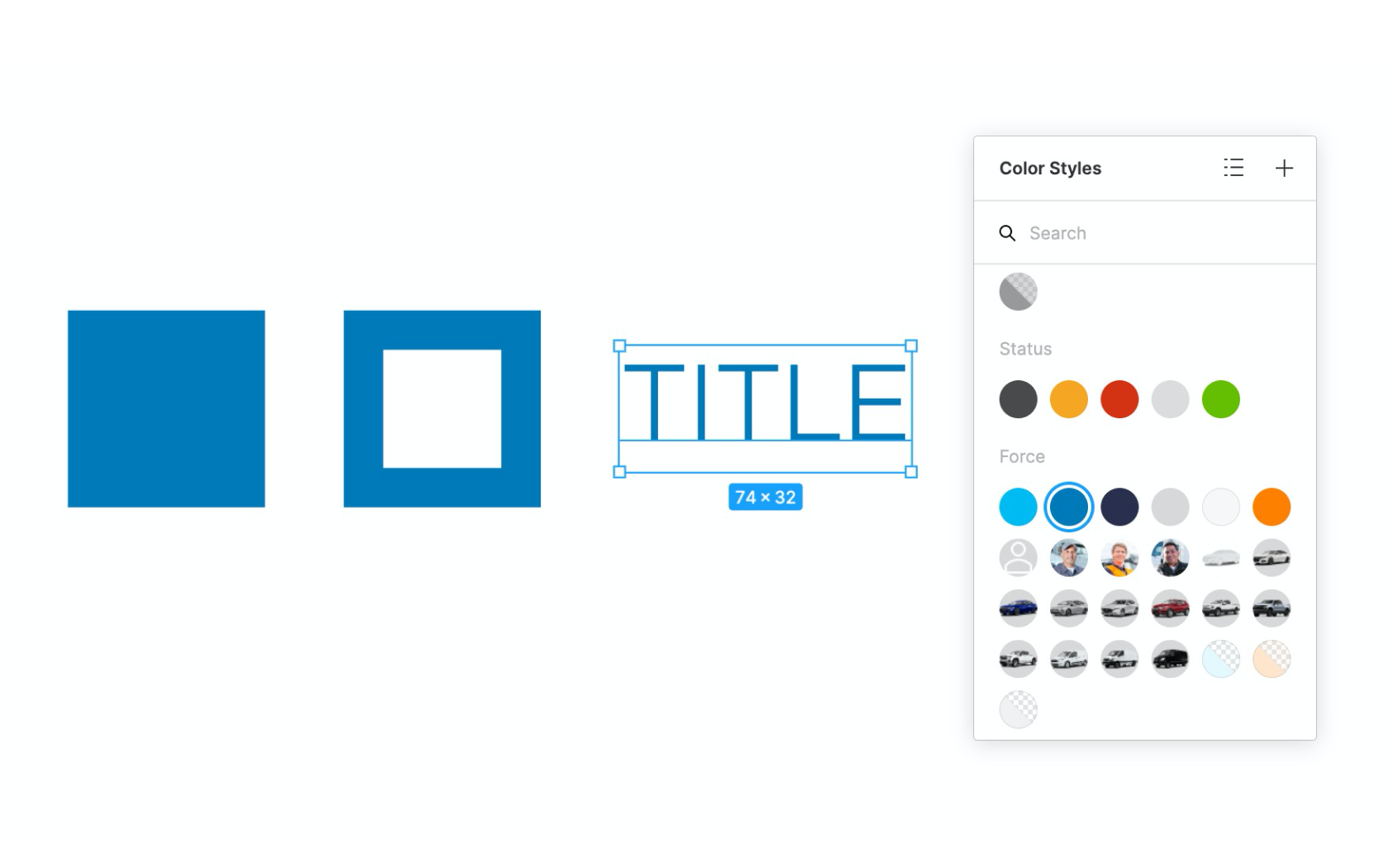
Figma's global treatment of colors—applying to fill, stroke, and type
An example of how color can be applied to text, independent of the type style
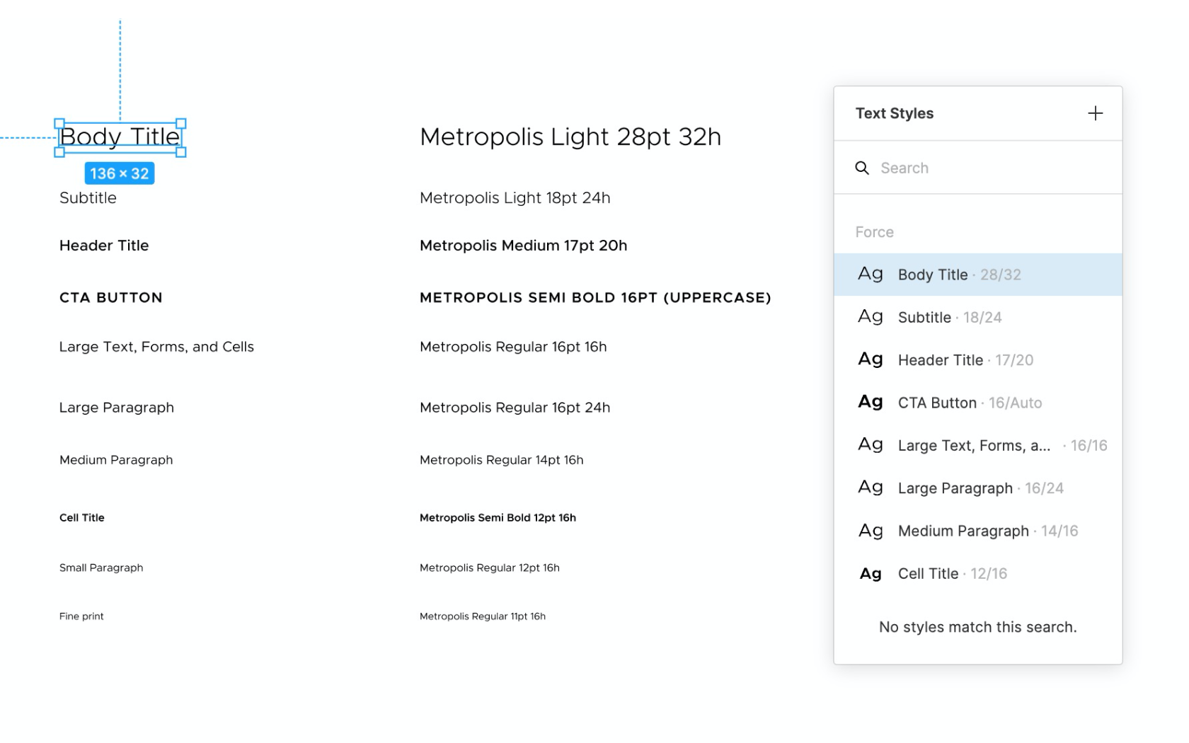
Without the constraint of color and alignment, I was able to remove over half of the previous type styles
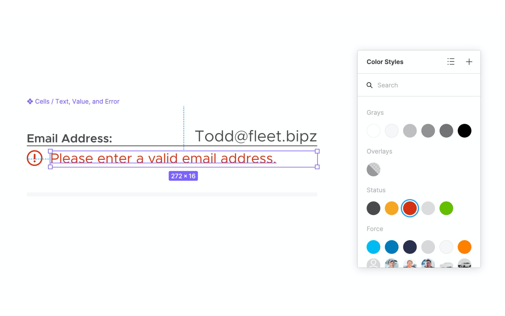
In addition to color and type styles, Figma implemented some other helpful features, such as image fills and effect styles. This helped to add even more consistency, especially when applying user and vehicle photos, or various types of drop shadows.
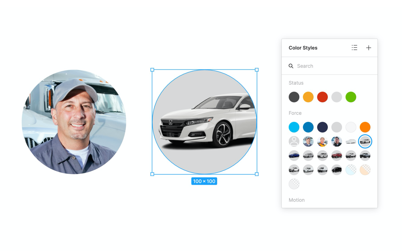
An example of how image fills can be easily applied through the use of color styles
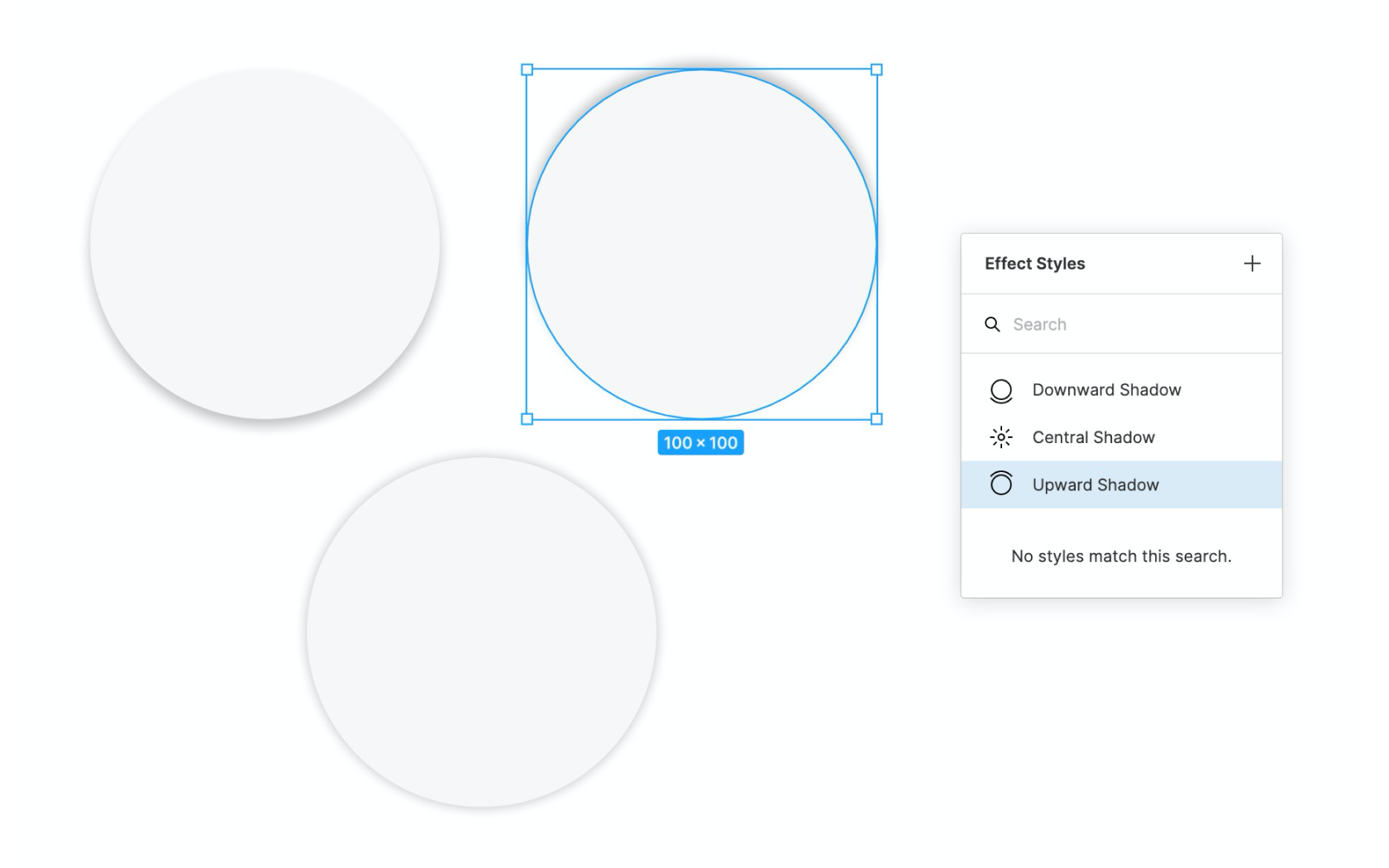
An example of effect styles used to apply various types of drop shadows
Components
When it came to building components, the auto-layout feature was truly a game changer because it allowed for our components to adapt dynamically to the content within, yet still allowed for uniform padding and spacing between the text or elements inside. This was really helpful for things like buttons, cards, or layouts where the length of text would dictate the width or height of the component.

Using auto layout to create a tooltip component
A place for everything
By far, the thing I appreciated the most was Figma’s thoughtful organization for all of these elements. Searching and managing text, colors, and components was much more straightforward in Figma than it was in Sketch. This was because of Figma’s simple interface, layout, and naming structure. Little things, like adding font size and line height next to the text style label, or having the ability to add descriptions to each style and component made it easier for us to view important details about our designs.
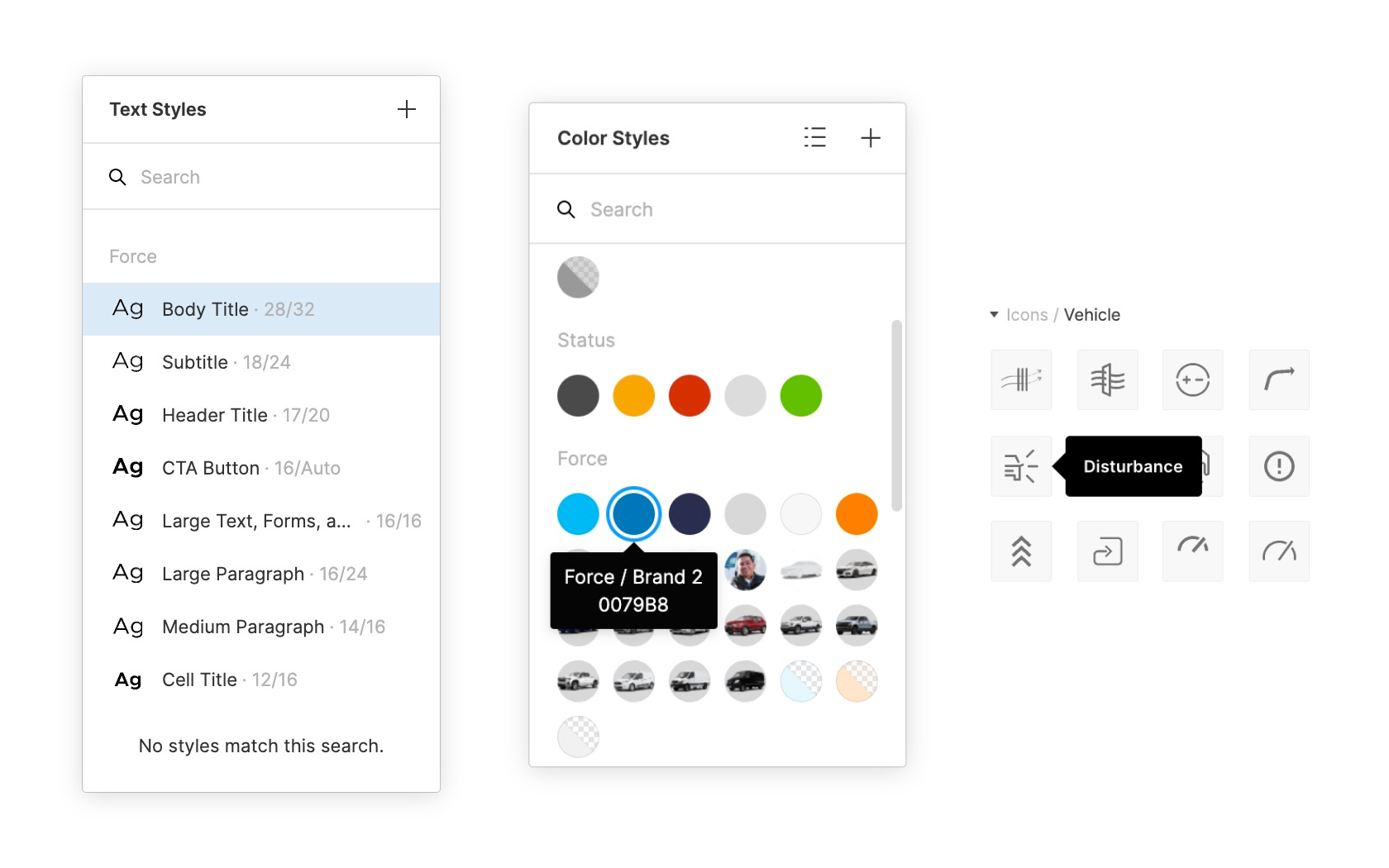
Figma's thoughtful organization, layout, and descriptions
Designing the design system
While the various parts of the design system were being created, I also worked on organizing and bringing everything together in a cohesive way. Within the same file, elements were grouped into categories and then grouped again into subcategories based on their feature or purpose. Trimming down the previous design system took a great deal of initial time and effort, but I think I was able to create a solid foundation that would be much more manageable and functionally scalable in the future.
Step 4: Incorporate the Zeplin styleguide
The final step was to upload our hi-fidelity screens, along with the colors, type, and components I had created in Figma. What made Zeplin useful in our workflow was its ability for developers to quickly reference all relevant spacing, styles, and components at a glance through the use of its global styleguide. It also did a great job at revealing which screens were using which components, and how they were all connected and reused throughout the apps.
Zeplin global styleguide for the mobile manager and driver apps
Get in Touch